

Do you want to create a mobile-friendly website for your membership website? If you are looking for a definitive guide, this is the right place. This article will show you how to create a mobile-friendly website for your membership business.
According to the studies conducted by a popular website, the amount of mobile traffic coming to a website or online shop increased drastically. So, to make more conversions and revenue, you need to ensure your website or business is optimized for mobile phones.
By default, most WordPress themes you see these days are responsive. Apart from WordPress themes, there are other essential things you must take care of.
This guide will help you solve all your doubts regarding making your membership website mobile-friendly. So without any further ado, let’s see the main steps to create a mobile-friendly website for your membership business.
Steps to Create a Mobile-Friendly Website for Your Membership Business
To create a new mobile-friendly membership website or modify the existing one, follow these steps:
- Ensure you are using a responsive WordPress theme
- Avoid pop-up ads at all cost
- Create better navigation menus
- Compress images
- Use a caching plugin and other strategies
- Regularly test your website design for flaws
- Use a better font for your business website
Below, we will explain each step so you will better understand each step’s importance.
Use a Responsive WordPress Theme

Your WordPress theme is vital in the responsiveness of a membership business. As you know, many free, freemium, and premium WordPress themes are available in the market. You can choose one according to your requirements.
For example, you can choose a theme optimized for speed, WooCommerce-ready, fancy sliders, or anything you want.
As we mentioned, most of the WordPress themes available in the market are responsive. So, there is no need to worry about this anymore. On the other hand, you can also ensure this before purchasing the theme by checking the demo website available.
Checking the demo websites will ease your task.
Avoid Pop-up Ads

Pop-up ads can be annoying. At least everybody can accept that. If you are using pop-ups on your membership website, you need to stop it.
If you use any popular email opt-in tool like OptinMonster or Bloom to generate leads, that’s okay. You can use them to generate leads and convert them to clients later.
On the other hand, when you use pop-ups just for monetization purposes, that’s not good. You need to avoid using pop-ups to make the website mobile-friendly.
Create Better Navigation Menus
Most people will use the primary navigation menu to search and get navigated quickly. Most WordPress themes come with two to three navigation menus. When you handle your navigation menus, ensure that the menus are optimized for mobile.
You can enhance the menu’s features using mega menu plugins or custom CSS codes. If the menus are not responsive and not optimal for mobile visitors, they must be changed.
Use an image Compressor

When you handle a membership website, you might add multiple images. Well, adding too many photos to a post is not ideal. Since images are more significant, they can affect the entire website’s speed.
To solve this issue, you need to use an image compressor plugin. If you are using WordPress to create your membership website, you can use any plugin like ShortPixel or Optimole.
On the other hand, if you prefer hosted services, check out TinyPNG. Having the images optimized will help you serve the website faster. It is a great way to make your membership website mobile-friendly.
Ensure the Website is Fast Enough

To get better rankings in mobile search (resulting in more site visitors and revenue), you need to ensure your membership business website is optimized for speed. You can do that by minifying static files like HTML, CSS, and JS. Plenty of reputable site optimization plugins can guarantee a massive speed boost without extra headaches, but NitroPack stands out as the all-in-one optimization solution that site owners prefer.
It automatically optimizes all your website resources, such as code, images, videos, and fonts, so you can serve web pages as fast as possible. The plugin even comes with a built-in CDN, which is great if your traffic comes from different countries around the world.
Regularly Test Your Design
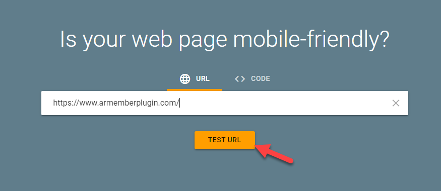
To ensure everything is going well, look at Google’s mobile-friendly test tool. Once you have entered the website’s domain and started the test, the tool will inform you about the optimization opportunities.
All you need to do is enter the domain name you need to test and start the test.
The process will take a couple of minutes. Once they have done analyzing the page, you will see the results.
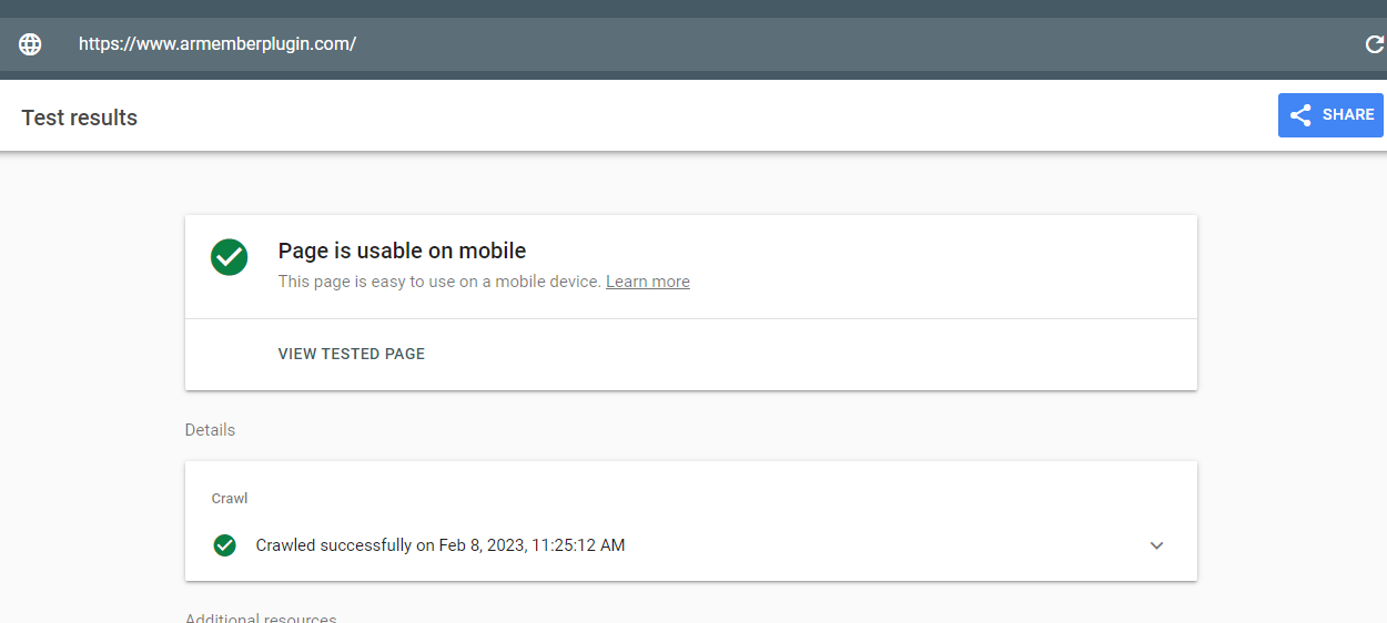
That’s it!
This way, you can check if your website is mobile-friendly or not.
Using a Better Font

Typography matters a lot. From a service like Google fonts, you can get a free web font you can use. When you run a membership website, use a professional font.
Fancy fonts won’t be feasible since you run a professional business. We highly recommend checking out fonts like Montserrat, Work Sans, or Nunito Sans.
On the other hand, if you prefer a premium font, look at Proxima Nova. Plus, ensure that you are using an optimal font size. You do not need to go too large or too small.
Usually, most people go with 16 or 17px font size.
Conclusion
Since the mobile traffic is spiking, you must make your membership business website mobile-friendly. As you have seen, there are multiple ways to make a membership website mobile-friendly. From choosing a theme to selecting a font, there are numerous strategies.
Most people use mobile phones to complete a purchase a browsing internet. Making your business mobile friendly can quickly get you more sales conversions and also help you reduce the bounce rate.
We hope you have found this article helpful and learned why and how to create a mobile-friendly website for your membership business. Feel free to go through our blog archive to learn about setting up a membership website and managing it.

Share this post