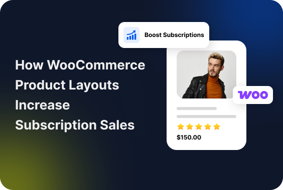
If your site’s layout clearly explains value, pricing, trust, and commitment, you have a higher chance of increasing subscription revenue.
Most WooCommerce subscription stores don’t fail because of weak offers. They often fail because default layouts hide subscription details, create confusion during plan comparison, and add unnecessary friction before checkout.
Unlike one-time purchases, subscriptions require trust and long-term confidence. If visitors can’t instantly understand what they’re paying, how often they’ll be charged, or which plan fits them best, they hesitate. And hesitation kills recurring revenue.
In this guide, you’ll learn how better WooCommerce product layouts reduce hesitation, improve clarity, and increase subscription sign-ups using subscription-focused design principles and tools like ShopEngine.
How Subscription-Based Buyer Behavior Is Different From One-Time Buyers
To optimize your layouts, you first need to understand how subscription buyers think. They are not an impulse, one-time decision maker.
A one-time buyer can regret later and move on. But when someone subscribes, it feels like committing to an ongoing relationship. That changes how they read, scan, and judge your product pages.
They repetitively reconsider whether this product really deserves a permanent spot in their monthly budget. So you must provide consistent value, clear communication, and a reason to keep saying yes to every billing cycle.
Here are the initial concerns of long subscribers:
- Spend more time comparing plans.
- Look for long-term value.
- Checks renewal details early.
- Are sensitive to hidden costs or vague billing cycles.
- Need reassurance that they can manage, pause, or cancel later.
Remember, they are not just buying a product. They are evaluating trust, predictability, and long-term usefulness. Your layout either supports that evaluation or silently works against it.
Psychology Behind Subscription-Based Site Layouts
Once you understand how subscription buyers think, the layout decisions get a lot clearer. The core principle of effective subscription layout design is simple.
It is less about flashy graphics and more about crystal-clear communication to reduce mental friction.
Clear Value Differentiation Instead Of Feature Overload
This is perhaps the most crucial point. When you have multiple subscription tiers, the goal is not to list every single feature under.
When you list everything equally, it makes nothing feel important. Visitors struggle to understand which plan fits them, so they delay the decision or leave.
Subscription pages often fail here and collapse under the weight of too many features.
It’s about highlighting the key differentiating factors that make one plan distinct from another. Clear differentiation works better than completeness. Each plan should feel purpose-built for a specific type of user, not like a shuffled list of checkboxes.
Visual Hierarchy For Pricing, Billing Cycles, and Benefits
Subscription anxiety comes from uncertainty. If users have to search for billing frequency, renewal terms, or price context, trust drops immediately.
Strong visual hierarchy solves this by:
- Making price and billing cycle unmissable
- Grouping benefits under clear headings
- Separating monthly vs yearly logic visually
Your layout should answer billing questions before users consciously ask them.
Reducing Cognitive Load During Plan Comparison
Every extra mental step reduces conversion probability. Subscription layouts should reduce thinking, not encourage analysis paralysis.
Side-by-side comparisons, consistent feature labels, and visual emphasis on recommended plans help users move forward without feeling rushed.
Common Woocommerce Layout Problems That Kill Subscription Conversions
Now that we know what should be happening, let’s look at the pitfalls many WooCommerce subscription sites fall into. If any of these sound familiar, you’ve found your hidden revenue leaks!
- Default WooCommerce layouts hide subscription value: WooCommerce, by default, built for single purchases. Thus, subscription details are mostly inside small text, secondary tabs or tooltips that users miss entirely. When renewal value is hidden, users judge the price without context and bounce.
- Pricing tables that fail to explain renewals and billing frequency: “$29” means nothing without time attached. Is it monthly? Yearly? Per user? If pricing tables don’t explain clearly about renewals and long term cost, customers will simply not get it.
- Poor mobile layouts for plan selection: Many subscription comparisons look acceptable on desktop and fall apart on mobile. Cramped columns, hidden features, and tiny toggles make plan selection frustrating. Mobile visitors do not tolerate friction. They leave.
- Too many clicks before users understand what they’re buying: If users have to click around too many tabs, scroll endlessly or open FAQs to understand the subscription, the layout is failing.
Key Product Layout Elements That Increase Subscription Revenue
Now, let’s talk about solutions!
Take a look at the essential layout elements that will help you convert more visitors into loyal subscribers.
Let’s get into the practical part. We will discuss the key elements that make the WooCommerce store subscription-friendly with a practical example of implementing them.
For this article, we will use the ShopEngine WooCommerce builder to design the subscription-friendly layout.
Quick Checkout For A Simplified Purchase Process
Subscriptions already feel like a big commitment. Never make the checkout feel like a chore. Every step added to the checkout process is a potential point of abandonment. Thus, a clean, focused checkout is not only a design choice, but a conversion requirement too.
- Guest Checkout Option: Never force users to create an account before buying. Offer guest checkout and then prompt them to create an account after the purchase is done.
- Minimal Fields: Only ask for essential information to purchase the subscription.
- Progress Bar: A visual progress bar helps buyers understand how many steps are left before finally getting the product.
- Order Summary: Show the subscription details such as recurring charge before the final payment.
- Saved Payment Methods: Let returning subscribers save payment methods for simple future renewals or plan changes.
ShopEngine’s Quick Checkout lets users bypass the cart and head straight to payment. So go to ShopEngine → Add-ons.
Find Quick Checkout and click on the icon to open the settings window.
1. Then, enable the add-on if it’s not enabled already.
2. Add a Button Label for quick checkout.
3. Decide how the Quick Checkout Mode will appear.
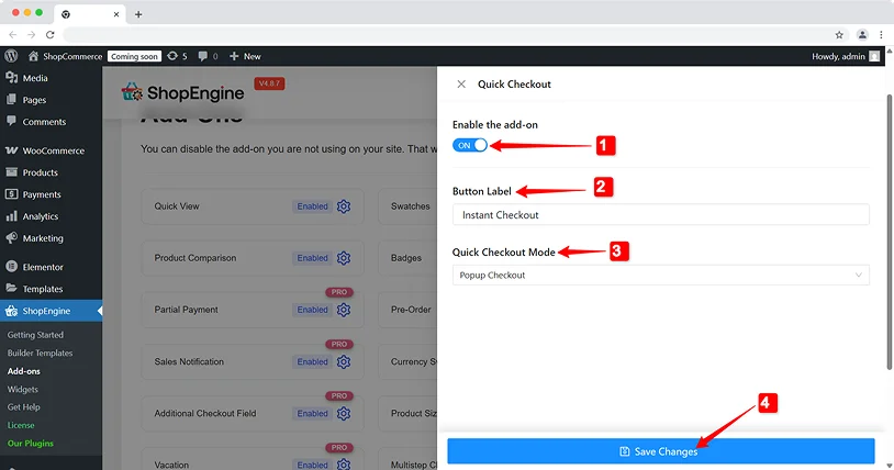
If you select ‘Popup Checkout’, the checkout will appear in a pop-up window. Whereas for the ‘Redirect Checkout’, a new page will load to complete the checkout process.
4. Now, click on the Save Changes button to finalize the settings.
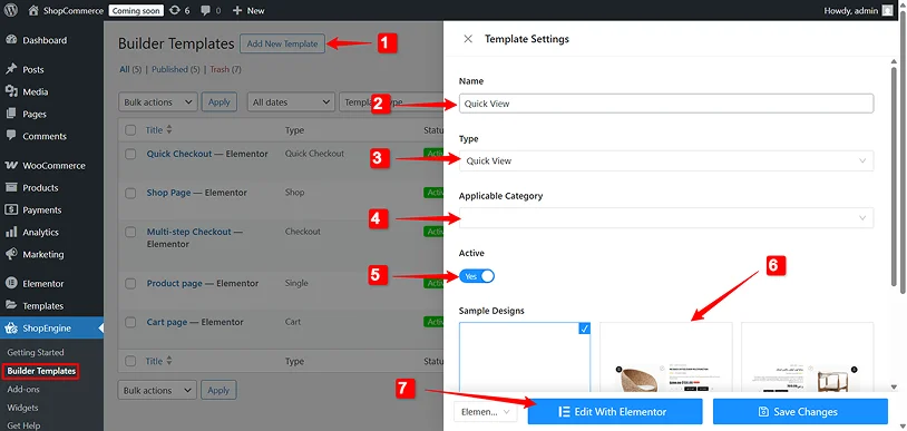
Once you activate the Quick Checkout, you need to design the Quick Checkout layout. To create a layout, go to ShopEngine → Builder Template, and click the Add new Template. In the settings window,
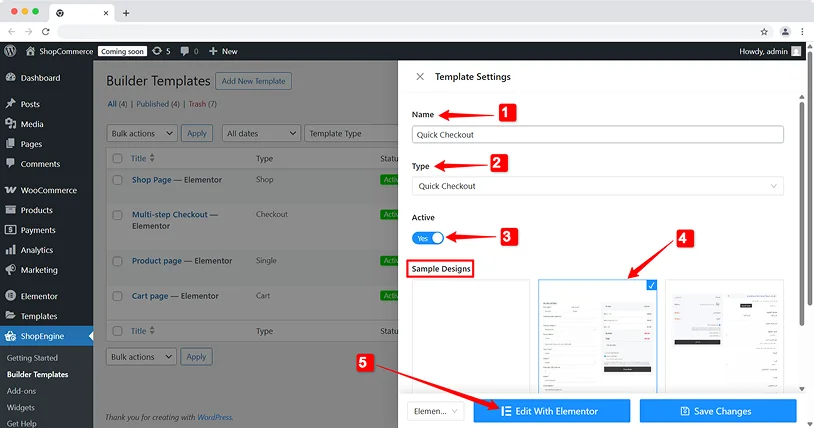
- Add a name for the template.
- Set the template Type to ‘Quick Checkout’.
- Activate the template.
- Under Sample Designs, select a ready template to get started.
- Finally, click on the Edit With Elementor to preview and make changes in the design, or select Save Changes go instantly.
Quick View For “What’s Inside”
When you offer a subscription or a digital bundle, users want to see what they are getting with the subscription. If you provide a quick view popup that shows the contents without leaving the shop page, you have a higher chance of conversion.
Use the Quick View to trigger a pop-up that lists the details of the subscription plan, keeping the user in the shopping flow.
For subscription services with varying content, users want a peek.
- Trigger from shop/category pages: Add a “Quick View” button for each plan that opens a modal.
- Key information in modal: Inside the quick view, display the main product image, price, a brief description, and crucially, a concise list or image carousel of what’s included in the current or upcoming box/service period.
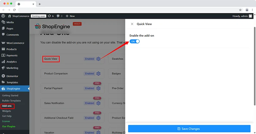
You can use ShopEngine’s Quick View feature to provide details in the popup window.
To use this feature, go to ShopEngine → Add-ons again, find Quick View, and enable the add-on.
After that, create a layout for WooCommerce quick view. For that, navigate to ShopEngine → Builder Template. There you have the following options:
- Add New Template: Click on this button to create a new template.
- Name: Enter a name for the template.
- Type: Set the template type to Quick View.
- Category: Choose the categories where you want to show a quick view.
- Activate: Switch the toggle button to activate the template.
- Sample Design: Select a ready-made template to use as a ready design.
- Now, if you want to edit the layout, click on the Edit with Elementor button.
Otherwise, simply save the changes and move forward.
Flash Sale Countdowns For Limited Sign-Up Windows
Using a Flash Sale Countdown widget creates urgency. So urgency is exactly what you need to push users to buy, especially when there’s limited spots or special introductory offers.
In the subscription world, this is an effective way to reduce the “I’ll think about it” delay.
- Prominent Countdown Timer: Display a visually appealing countdown timer directly on your product or pricing page.
- Clear Offer Details: State exactly what the flash sale entails (e.g., “20% off your first 3 months,” “Limited to the first 100 sign-ups”).
- Scarcity Messaging: Show messages such as “Limited spots available!” to create the sense of urgency.
- Integration: Make sure the countdown timer never interrupts the customers experience or turns the layout upside down.
Wanna set up a flash sale countdown time? Simply enable the feature from ShopEngine → Add-ons.
If you want to prioritize flash sales over regular sale campaigns, enable the Override WooCommerce sale price option as well.
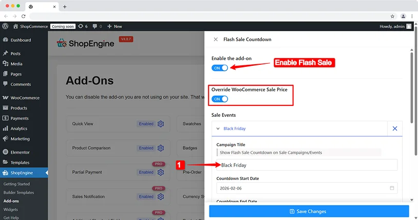
Now, for setting up our flash campaign, hit on the Add Item button under the Sale Events.
There, you can create one or multiple flash sale campaigns. To configure a campaign:
1. Campaign Title: Enter a title for the campaign.
2. Countdown Start Date: Set when the flash sale countdown timer will start appearing on the website.
3. Countdown End Date: Set when the campaign will end.
4. Applicable Categories: Choose which categories you want to offer a flash sale. You can choose multiple categories.
5. Product List: Select the subscription plans under those categories that you want to apply a flash sale to. You have the option to choose multiple products here, too.
6. Discount type: Decide whether you want to discount a fixed amount or a percentage of the main subscription fee.
7. Discount Amount: Set the discount you want to offer.
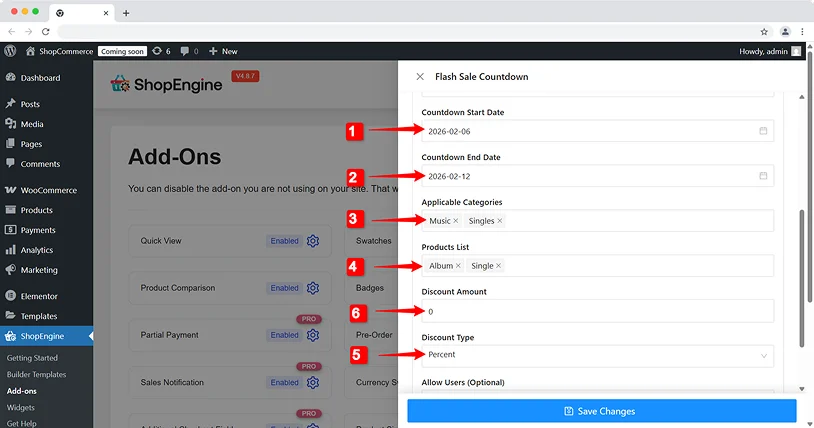
Finally, click on the Save Changes button.
Now you can easily prompt a flash sale campaign for the selected subscriptions on your site to rush the customers to subscribe to a plan.
Variation Swatches For Delivery Frequencies
If your subscription involves physical products, how often they’re delivered is a key decision point. Ditch the clunky dropdowns.
Visual Swatches: Remember to use visually appealing buttons or swatches such as Monthly, Bi-Monthly, or Quarterly.
Price Adjustment Display: When users choose how often they want deliveries, the price should change right away. If they pick deliveries that happen less often, the price should show any money they save.
Clear Description of Each Frequency: A tooltip or small text explaining what “Bi-Monthly” means (e.g., “Every 2 months, saving you X% on shipping”).
Enhance The “My Account” Experience
Your relationship with a subscriber doesn’t end after the initial purchase; it truly begins. A well-designed “My Account” area is crucial for retention.
Dashboard Overview: A clean dashboard showing active subscriptions, next billing date, and easy access to payment methods.
Easy Subscription Management: Allow users to easily:
- View Subscription Details: What plan they’re on, when it renews.
- Change Plans: Upgrade or downgrade by showing clear pricing differences.
- Update Payment Method: Without needing to contact support.
- Pause/Cancel Subscription: Make this process straightforward, not a hidden maze even though you don’t want users to cancel.
Order History: Show past subscription orders and any add-ons.
Personalization Options: If it applies, let users customize their subscription, like picking different products or choosing when deliveries arrive.
Create An Account Dashboard
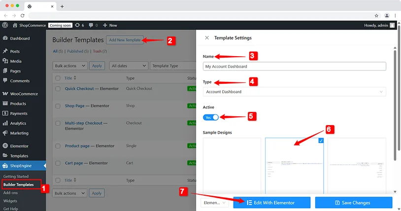
After that, design the account dashboard template:
- Move to ShopEngine → Builder Template
- Click on the Add New Template
- Enter a Name for the template
- Set the Type to Account Dashboard
- Activate the template by switching the toggle
- Choose a ready design from Sample Designs
- Then click on the Edit With Elementor to customize the design
With ShopEngine, you can redesign the My Account layout to feel empowering instead of confusing. When users feel in control, churn drops.
Tips For Subscription Layout Optimization
Designing effective layouts is always an ongoing process of refinement. Take a look here to some of the best tips for optimizing your subscription layout:
Test Layouts Instead Of Guessing
Small layout changes can dramatically affect subscription conversions. A different plan highlight, pricing order, or CTA placement can outperform assumptions. Test visually, not emotionally.
Monitor Plan Engagement, Not Just Sales
Beyond just tracking conversions, dive deeper into tracking the performance:
Ask yourself:
- Which plans are viewed most?
- Where users hesitate?
- How often users switch plans?
Engagement signals often predict future revenue better than raw sales numbers.
Iterate Layouts As Subscription Offers Evolve
Subscription businesses change. Your layouts should too.
Having new features, pricing models or bundles is the best way to do it and layout updates is a must.
Final Thoughts
Optimizing your WooCommerce product layouts for subscriptions is a must as intelligent design that directly impacts your business bottom line.
When you understand how subscription shoppers think, avoid common design mistakes, and plan your layout carefully, your site can become a strong tool for growth.
Don’t let your layouts be your hidden revenue leak any longer. Turn them into your biggest asset and boost your revenue right now!
Related Articles:

Share this post