


You spent weeks, maybe even months, creating your online course. You polished the lessons, built the curriculum and promoted it everywhere. But your online course landing page still is not converting the way you expected.
That can be very discouraging, especially when you know your online course is genuinely valuable. Because of this, many course creators think the problem is the course itself, yet that’s not true.
In many scenarios, the problem is the online course landing page. In fact, landing pages with poor optimization often convert below 2%, even when the offer itself is good.
A confusing headline, weak messaging, poor CTA placement or lack of trust signals can hurt conversions even if your course content is excellent.
The good news? Small landing page improvements can make a surprisingly big difference. And that is exactly what we’ll cover in this guide.
Read on to learn how to optimize your online course landing page and boost your conversion rates to make a smoother path from visitor to student.
TL;DR: Your online course landing page should sell the transformation, not just the course. Make sure to use clear messaging, powerful trust signals, eye-catching CTAs, and a friction-free user experience that turns visitors into paying students.
Why Your Online Course Landing Page Isn’t Converting

Many course creators assume on their own that low conversions means:
- The course is overpriced
- The niche is too competitive
- Or the content is not good enough
But that is rarely the real issue.
Speaking from experience, in many scenarios, visitors leave because the course landing page fails to build enough trust within the first few seconds. Yes, only the first few seconds! That’s all the time you have to make your first impression and trust.
Remember, people landing on your online course landing page do not know:
- who you are
- whether your course actually works
- or if your content is worth paying for
That means your course landing page has to answer important questions almost immediately:
- What does this course help me achieve?
- Is this course right for me?
- Why should I trust this creator?
- Is this worth the investment?
- What happens if it does not work for me?
If your page does not answer these questions clearly, visitors hesitate. And when people hesitate online, they simply leave the same way a customer leaves a shop without buying anything.
Think of your online course landing page as your store’s first impression. You get all the good decor, lighting, comfortable and trust-building atmosphere to build customer’s trust and explain them in-person. But online, we don’t have that option. So, your online course landing page is the only thing you have to fix to make that same impression.
This becomes even more important today because online buyers are more skeptical than ever. AI generated courses, low quality creators, free online courses on YouTube and overhyped marketing promises have made people far more cautious before buying any digital products.
Because of this, modern online course landing pages need to do more than just “look good.”
They need to:
- Build trust quickly
- Communicate outcomes clearly
- Reduce friction
- And guide visitors toward action naturally
The good news is that you do not need a flashy design or complicated sales funnel to skyrocket conversions.
Sometimes, fixing a weak headline, improving readability or adding better trust signals can improve your landing page conversion rates too.
Let’s start with one of the biggest mistakes most course creators make: selling the course instead of selling the outcome.
Stop Selling the Course — Sell the Outcome
#1st rule of selling online courses is people don’t buy courses; they buy the version of themselves they become after talking them.
Too many course creators explain the curriculum before explaining the outcome.
If you only show features on your online course landing page such as “X course has 10 modules” or “Y course has 5 workbooks”, you’re only forcing customers to do the math and mental work of connecting the dots. The only thing this increases is bounce rates, not conversion.
Why? Because no one is buying those things. They are buying the outcomes.
Think about it yourself: Will you purchase a fitness course because it has 40 lessons? Or, will you purchase it because you want to get fit, feel healthier, look better or become more confident.
The same way, no one buys a business course because it includes worksheets. They buy because they want more income, freedom or career growth.
That’s why you must always translate every feature into a tangible outcome and keep your copy razor sharp.
1. Turn Features Into Emotional Outcomes

Buyers make decisions based on emotion and justify them with logic.
Stop listing the physical specs of your online course on your landing page, and start showing the transformation. Let us show you how it’s done:
Suppose you have a video tutorial on cold emailing. Then go for the copy like this that comes with emotional outcome as if you’re talking with that person:
“Get the exact scripts that book 3 paying clients this week-without the soul-crushing fear of cold calling.”
A good online course landing page should connect features to real-life benefits and emotional results. A simple way to improve your course sales page copy is to ask, “What does this feature actually help the student achieve?” Then write your messaging around that result.
2. Write for Clarity, Not Cleverness

We’ve gone through so many online course’s landing pages and websites. The first mistake we noticed is many course creators try to sound overly creative or impressive on their landing pages.
Ruthless clarity beats creative jargon every time. If your audience has to pause to figure out what you mean, they will simply scroll past.
Your messaging should feel simple, direct, and easy to understand within seconds.
For example:
Never go writing copy like this for your online course landing page:
“Unlock the hidden framework for unstoppable growth”
This clearly sounds like the work of marketing. And when people see these kinds of lines, they immediately feel tricked. They know it is just a sales pitch.
When readers encounter hyper-inflated buzzwords, their internal marketing defense system goes up. They do not think about growth; they think about being manipulated by a generic sales script.
Instead, that’s why you could simply say:
“Learn how to grow your freelance business with a proven client acquisition system.”
The second example is clearer, more specific and easier for visitors to trust.
This matters even more today because online users skim content very quickly. If your message feels vague or difficult to understand, many people will leave before reading further.
The goal is not to sound smarter but to make your value obvious as quickly as possible.
Your Headline Has One Job — Make People Keep Reading

Optimize your online course landing page by making sure your headings are always eye-catching.
Why? Because your headline is the first thing visitors notice when they land on your course page. And in many cases, it decides whether they keep reading or leave within seconds.
Most visitors won’t scroll far enough to discover your best selling point. That is why your headline should not try to sound overly smart, dramatic or creative.
Its main job is very simple: Quickly explain what your course helps people achieve and give them a reason to continue scrolling.
Let’s take a look at one of the most popular online course sites: HubSpot Academy.
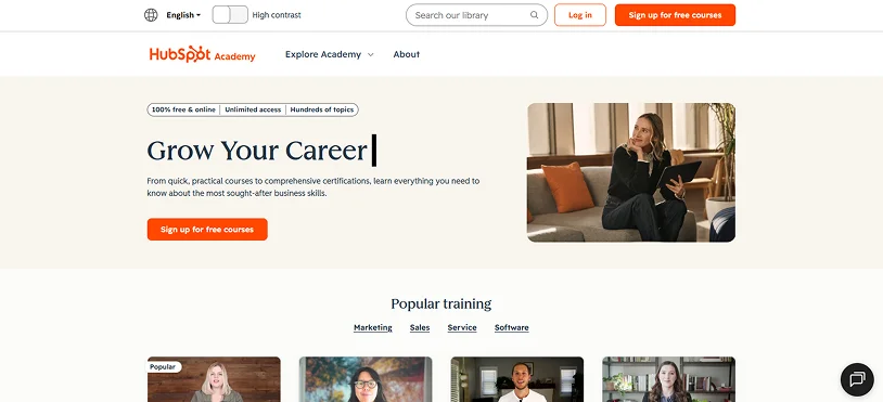
When I first landed on their online course site, the first thing that caught my eye was their heading.
“Grow Your Career” “Grow Your Organization”
This is not only easy to read but also the exact reason why people clicked on their website.
Thus here are some ways to make your headlines more effective.
3. Fix Weak Headlines First
Weak headlines are one of the biggest reasons online course landing pages fail to convert. Most of all the headlines we have seen so far on low-conversion online courses sound too vague, overly clever or generic which makes visitors lose interest.
A headline like “The Ultimate Success Blueprint” does not clearly explain what the course actually offers. But “Learn How to Start a Freelance Writing Business From Scratch” immediately tells visitors what they will learn and who the course is for.
Simple and clear headlines always perform better because they lower confusion and make the value easier to understand.
4. Add a Subheadline That Removes Doubt
Your headline grabs attention but…your subheadline builds trust. You must reassure visitors by answering questions like:
- Is this beginner friendly?
- How long will it take?
- What makes this course different?
Let’s say if your Headline is like this:
“Learn How to Build and Sell Online Courses”
Then make your Subheadline like this:
“A beginner friendly course for creators to launch their first profitable course with no expensive software or technical skills.”
A good subheadline makes your offer feel more approachable.
5. Use Curiosity Without Creating Confusion

Curiosity can help people keep reading, but confusing headlines hurt conversions.
This creates curiosity while still clearly explaining the benefit. Visitors should feel interested, not confused.
6. Improve CTA Placement and Button Copy
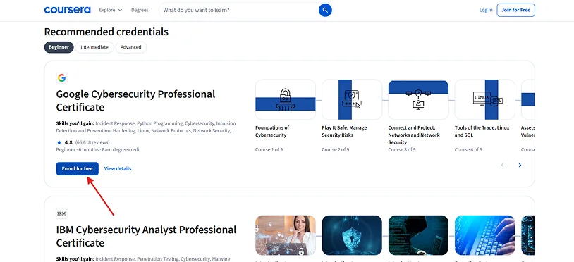
Even the best optimized online course landing page can lose conversions because of weak CTA strategy. Many course creators hide CTAs too far down the page or use generic button text like “Submit” or “Click Here.”
Thus make sure to use action focused phrases such as:
“Start Learning Today” “Get Instant Access” “Enroll in the Course”
Your CTA should also appear in important areas across the page, especially near the top, after key sections and around testimonials or pricing details.
The easier the next step feels, the more likely visitors are to take action.
Build Trust Before Asking for the Sale

Most visitors do not land on your online course sales page ready to buy immediately. They are usually comparing options, questioning promises and trying to decide whether your online course is worth the penny and time.
That’s why building trust before asking for the sale is important, as modern customers (leaners and students) are naturally cautious and look for specific indicators of credibility before making purchases.
A highly optimized online course sales page make people feel:
- Understood
- Reassured
- And confident about taking the next step
7. Good Testimonials Can Sell Your Course Better Than You Can
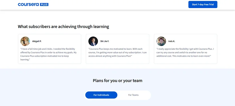
People naturally trust other students more than marketing copy.
Thus having testimonials on an online course page is one of the most powerful trust signals. But generic reviews like:
“Amazing course!”
“Highly recommended!”
And so on…usually do not help much.
The best testimonials explain:
- The student’s original problem
- The result they achieved
- And how the course helped them improve
Specific testimonials feel more believable and relatable which can make your offer feel far more trustworthy.
Expert Insights: Don’t create fake testimonials because they’re way easy to detect the second you read.
8. Position Yourself Like a Guide, Not a Guru
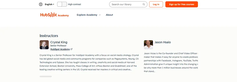
Many course creators try too hard to sound like experts. But modern audiences actually connect more with creators who feel helpful, relatable and honest instead of giving fake promises.
Thus never positioning yourself as someone who has all the answers, because we all know that’s impossible. Instead, position yourself as someone who understands the student’s struggles and can guide them through the process.
9. Reduce Risk With Guarantees and FAQs
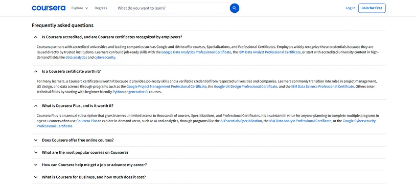
We’ve seen most of students wonder with questions like:
- What if this course is too advanced?
- What if it does not help me?
- What if I waste my money?
To solve all these questions, adding FAQs can optimize online course landing page conversion to the next level.
A simple refund policy, beginner friendly explanation or FAQ section can remove doubts before they become objections.
Expert Insights: You can also add an AI-chatbot in your landing page of an online course.
A Clean Course Sales Page Usually Converts Better Than a Fancy One
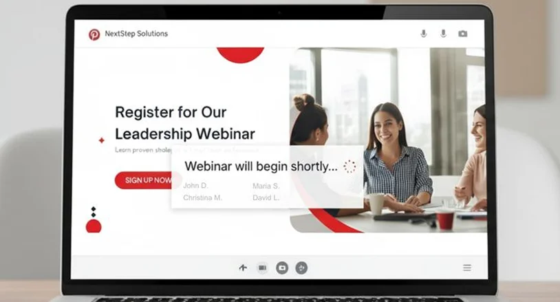
A beautiful page still fails if visitors don’t immediately understand who the course is for.
We talked with many beginner course creators, and most of them just assume they need flashy animations, complicated layouts or overly creative designs to impress visitors, and stand out in the crowded competitive market.
Although the fact that the online course business market is competitive is true, too-beautiful landing pages sometimes create confusion and make visitors question your authenticity.
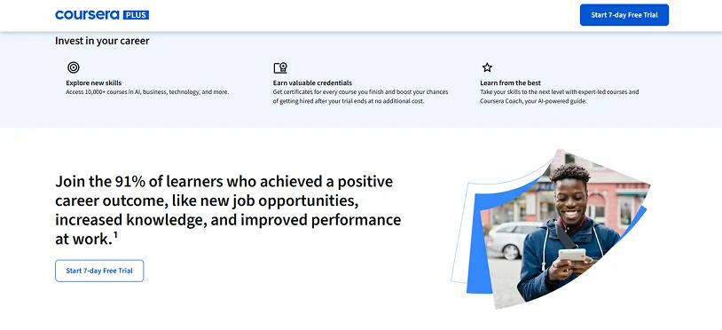
Pick whatever most popular online course site you can. Whether be it HubSpot Academy, Udemy or Coursera, all of them have a clean and simple online course landing page which helps visitors focus on:
- Offer
- Benefits
- And next action they should take
10. Improve Readability for Faster Decisions
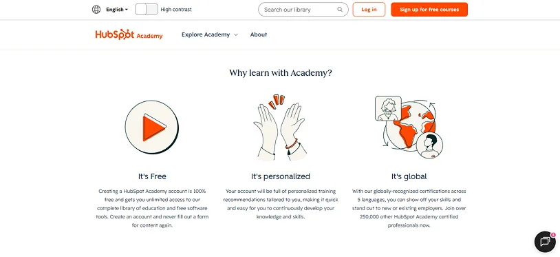
When a page is difficult to read, visitors lose interest and leave. No one has time to read every word on an online course sales page; they simply scan it to decide if the course is worth their time.
So, make sure to use:
- Short paragraphs: Keep blocks of text to 2-3 sentences at most.
- Bullet points: Make sure to add bullet points for easy skimming.
- Whitespace: Be generous with margins around your text for better readability.
- Easy-to-read fonts: This is not a fancy school project. Keep your font classic with a minimum size of 16px and high contrast font color.
The easier your page feels to read, the easier it becomes to make a decision.
11. Most People Will See Your Course Page on Their Phone

Because a large percentage of visitors will first see your online course landing page on a smartphone or tablet, a mobile-first design is non-negotiable.
That means your course page should feel smooth and easy to navigate on all smaller screens.
Small Conversion Tweaks That Can Increase Course Sales

Optimizing an online course landing page never needs complete makeover.
Things such as better CTA placement, shorter checkout flows or clearer messaging can improve the overall visitors experience way better than ever.
12. Add Video for Faster Trust Building
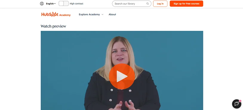
Video lets your visitors understand your course faster than text alone.
A short introduction video of 60-90 seconds lets potential students hear your voice, see your personality, and understand what your course offers.
And the best part? Your video does not need expensive production quality. In most cases, a clear and authentic explanation works better than something too perfect.
13. Use Micro-Commitments Before the Main CTA
Not every visitor is ready to buy immediately. That is why micro-commitments can work so well.
Ask for a low-risk interaction before pushing for the big sale. You can encourage smaller actions first such as:
- Downloading a free guide
- Watching a free lesson
- Joining your email list
- Taking a quiz
Once people engage with your content, they will be more comfortable taking the next step.
14. Remove Friction From Checkout
A complicated checkout process can quietly hurt conversions. Even interested visitors may abandon the process if:
- There are too many steps
- Forms feel overwhelming
- Payment options are limited
Thus audit your checkout page to ensure it never takes more than 60 seconds to complete. Yes, 60 seconds because that’s all time it takes before a customer starts questioning and overthinking.
Also, you should make pricing, refunds and payment details easy to understand before visitors reach checkout.
15. A/B Test Headlines, CTAs, and Pricing Sections
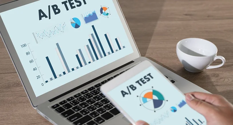
What works for one online course may not work for another. Thus you must test everything such as:
- headlines
- CTA buttons
- pricing layouts
- testimonials
Never guess what works best. Use A/B testing to make decisions based on real user behavior and conversion data.
Final Thoughts
A high converting online course landing page is built on 3 pillars of online course businesses:
- Clarity
- Trust
- A smooth user experience
When visitors hop on your online course landing page, they should quickly feel guided. Your landing page should speak in their language to make them understand what the course offers, who it is for and how it can help them.
As they scroll, trust signals, messaging, and structure all work together to support their decision-making process.
In the end of the day, even small improvements in these areas can lead to noticeable growth in conversions and course enrollments.
Related Articles:

Share this post


