


A website can look beautiful and still lose you money. You have probably seen it happen: a slick design and almost no sign-ups, sales, or inquiries. Visitors arrive, glance around, and leave.
The gap is this: looking professional and converting are two different jobs. A professional website earns trust in the first few seconds. A converting website turns that trust into a specific action, a purchase, a lead, a booking.
This guide walks through how to design WordPress websites that look professional step by step. You will learn how to set goals before you touch a builder, choose the right foundation, add modern animation without wrecking performance.
TL;DR: A professional design WordPress website that converts combines four things: a fast, well-hosted foundation; a clear page structure with obvious next steps; a clean, mobile-first design that earns trust; and conversion-focused copy paired with strong calls to action.
1. Define Your Website Goals Before Designing
Designing a WordPress website without a goal is decoration. Before you pick a theme or a color, decide what a “win” looks like for this specific site.
Business Websites vs Blogs vs Portfolios
Different site types convert on different actions and that changes every design decision downstream.
| Site Type | Primary Conversion | Design WordPress website Priority |
| Business / service | Lead form, call, booking | Trust signals, clear services, easy contact |
| E-commerce | Purchase | Product clarity, fast checkout, reviews |
| Blog / content | Email sign-up, ad view, affiliate click | Readability, related content, sign-up placement |
| Portfolio | Inquiry, hire request | Visual proof of work, a strong about page, contact CTA |
Understand Target Audience
You cannot design a WordPress website for “everyone.” Write down who the site is for, what problem they arrive with, and what they need to see to feel confident. A freelance designer’s portfolio speaks to art directors and founders. Different types of audiences need different tones, different proof, and different first screens.
Create a Conversion-Focused Strategy
Pick one primary conversion goal per page. A homepage might guide toward “book a call.” A blog post might guide toward “join the newsletter.” When a page tries to do five things, it usually does none of them. Decide the single most important action, then design the page to make that action the path of least resistance.
NOTE: Write your primary goal at the top of your design file before you start. Every element on the page should either move the visitor toward that goal or get cut.
2. Choose the Right WordPress Foundation

Your foundation decides your ceiling. An attractive design on slow hosting still feels inexpensive because it feels slow.
Select Quality Hosting
Shared hosting is the most common hidden reason sites underperform. Look for hosting with solid uptime, server-level caching, a recent PHP version, and a data center near your audience. Managed WordPress hosts cost more but handle caching, updates, and security so you spend time designing instead of firefighting.
Pick a Fast WordPress Theme
Choose a lightweight theme that does not load features you will never use. Bloated multipurpose themes ship with sliders, page builders, and demo assets that drag down every page. A lean theme gives your builder and your content room to breathe.
Performance Matters From Day One
Speed is not a final-step optimization. It is a design constraint you carry from the start. Slow pages lose visitors before they read a word, and Google treats page experience as a ranking factor through Core Web Vitals.
3. Plan Your Website Structure Before Building Anything

Most people open a builder and start dragging. That is how sites end up with orphan pages, confusing menus, and dead ends. Plan the structure first.
Sitemap Planning
Sketch every page and how they connect before you build. A simple diagram or even a bullet list works. This shows you the whole site at a glance and stops you from missing key pages or burying important ones three clicks deep.
Essential Pages Every Website Needs
Most professional business sites need, at minimum:
- Home: the overview and the main path forward
- About: who you are and why you can be trusted
- Services or Products: what you offer, clearly
- Contact: how to reach you, with a form
- Pricing: if you can show it, show it
- Blog or Resources: content that answers questions and pulls in search traffic
- Legal: privacy policy and terms
Create Intuitive Navigation
Navigation should be boring in the best way. Use plain labels (“Services,” not “What We Do Best”), keep the top menu to around five to seven items, and put your primary CTA in the header where it is always visible. If a visitor has to think about where to click, you have already added friction.
4. Choose the Best Page Builder for Professional Websites

WordPress runs on page builders for most non-developers. The one you pick shapes your speed, your flexibility, and your site’s performance.
Gutenberg
The built-in block editor. It is free, native, fast, and improving quickly. For content-first sites and blogs it is often all you need. For complex, pixel-precise layouts it can feel limiting without extra block plugins.
Elementor
The most popular visual builder, with a huge ecosystem of add-ons and templates. It is beginner-friendly and flexible. The trade-off is weight: Elementor sites can carry extra code that needs careful optimization to stay fast, especially on older versions.
Bricks Builder
A modern, developer-minded visual builder known for clean output and strong performance. Bricks produces lean markup, which makes it a favorite for people who care about Core Web Vitals and want visual control without the bloat. Its terminology and structure sit close to how the web actually works, so it scales well from simple sites to complex builds.
Beaver Builder
A stable, reliable builder with a long track record, popular with agencies for its predictability and clean code. It is less flashy than Elementor but dependable for client work.
Which One Should You Choose?
| Builder | Best For | Performance | Learning Curve |
| Gutenberg | Blogs, content sites, lean builds | Excellent | Low |
| Elementor | Beginners, large template needs | Good with optimization | Low |
| Bricks Builder | Performance-focused pro/agency builds | Excellent | Medium |
| Beaver Builder | Reliable agency client work | Good | Low to Medium |
There is no single winner. If you are starting out and want the biggest ecosystem, Elementor is a safe entry. If performance and clean output matter most, Bricks Builder is a modern high-performance choice worth learning. Both have strong animation options too, which brings us to the part of design most people get wrong.
5. Design WordPress Website With a Clean, Professional User Interface

To professionally design WordPress websites is mostly restraint. Clean beats clever almost every time.
Visual Hierarchy
Guide the eye on purpose. The most important thing on a page (usually the headline and primary CTA) should be the most visually prominent through size, contrast, and position. Everything else supports it. If everything shouts, nothing is heard.
White Space
Space is not a wasted room. It is what makes content readable and a design feel premium. Generous padding around sections, headlines, and buttons gives the eye somewhere to rest and makes the important elements stand out.
Typography
Pick two fonts at most: one for headings, one for body. Keep body text at a comfortable size (16 to 18px is a good baseline) with generous line height. Readability beats personality. If people cannot read it easily, the font choice does not matter.
Color Psychology
Use a restrained palette: one primary brand color, one accent for CTAs, and neutrals for everything else. Reserve your accent color almost entirely for actions you want people to take, so buttons visually pop. Consistency here is what makes a site feel designed rather than assembled.
Consistent Branding
Use the same colors, fonts, spacing, and button styles across every page. Consistency signals competence. Inconsistency, mismatched buttons, three shades of blue, random font sizes, quietly tells visitors the operation is sloppy.
6. Build Mobile-First Responsive Pages

More than half of web traffic is mobile. Design WordPress website for the small screen first, then expand to desktop, not the other way around.
Responsive Layouts
Build layouts that reflow cleanly from phone to desktop. Single-column stacks on mobile, multi-column on wider screens. Test that nothing overflows, overlaps, or gets cut off at common breakpoints.
Flexible Typography
Use responsive font sizing so headings scale down gracefully on phones. A 60px hero headline that looks great on desktop can be unreadable, or broken, on a 375px screen.
Touch-Friendly Navigation
Buttons and links need to be large enough to tap with a thumb, with enough space between them to avoid mis-taps. A tap target of around 44px is a common minimum. Hamburger menus should open smoothly and close easily.
Mobile Testing Checklist
Before launch, on a real phone, check:
- Text is readable without zooming
- Buttons are easy to tap
- Images load and fit the screen
- Forms are usable with a mobile keyboard
- Nothing overlaps or overflows horizontally
- The primary CTA is visible without excessive scrolling
7. Improve User Experience (UX) to Increase Conversions

Good UX removes reasons to leave. Every point of friction is a place where a potential customer gives up.
Reduce Friction
Cut steps. Shorten forms to the fields you actually need. Remove pop-ups that block content on arrival. Every extra click, field, or obstacle costs you conversions.
Easy Navigation
Visitors should always know where they are and where to go next. Clear menus, visible CTAs, and logical page flow keep people moving toward your goal instead of hitting dead ends.
Reading Flow
Structure content so it is scannable. Short paragraphs, clear headings, and bullet points let people skim, find what they need, and act. Walls of text get skipped.
Accessibility Basics
Accessible sites reach more people and tend to convert better because they are clearer for everyone. Use sufficient color contrast, add alt text to images, make sure the site is keyboard-navigable, and respect reduced-motion preferences (more on that in the animation section).
Trust Signals
People buy from sites they trust. Reviews, testimonials, recognizable client logos, security badges, and clear contact information all reduce the anxiety that stops a purchase. Place them near decision points, especially close to CTAs and pricing.
8. Create Landing Pages That Convert Visitors into Customers
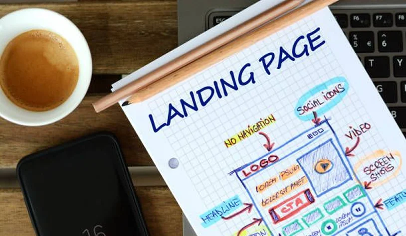
A landing page has one job: turn a visitor into a customer or lead. Here is the anatomy of one that works.
Hero Section
The first screen must answer three questions instantly: what is this, who is it for, and what do I do next. A clear headline, a supporting subheadline, and one primary CTA. No clutter, no confusion.
Benefits vs Features
Features describe the product. Benefits describe the reader’s better life. “500GB storage” is a feature. “Never worry about running out of space” is a benefit. Lead with benefits, support with features.
Social Proof
Show that other people already trust you. Testimonials, review counts, star ratings, case study numbers, and client logos all work. Specific proof beats vague praise: “Cut our reporting time by 40%” beats “Great product.”
Testimonials
Use real testimonials with a name, a photo, and ideally a role or company. The more specific and human, the more believable. A quote about a concrete result is worth more than five generic compliments.
Pricing
If you can show pricing, show it. Hidden pricing creates friction and distrust. Present plans clearly, highlight the recommended option, and make the differences between tiers obvious at a glance.
Call-to-Action Placement
Place your primary CTA in the hero, then repeat it at natural decision points down the page, after benefits, after social proof, after pricing, and at the end. A visitor ready to act should never have to scroll back up to find the button.
9. Add Modern Animations Without Hurting Performance
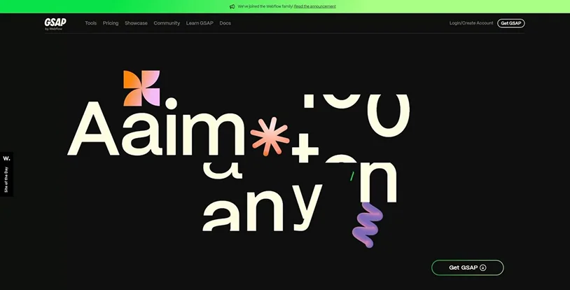
Animation is where “professional” and “trying too hard” live next to each other. Done well, motion guides attention and makes a site feel alive. Done badly, it distracts, annoys, and slows everything down.
Why Subtle Animation Improves Engagement
Purposeful motion directs the eye, signals interactivity, and makes content feel responsive. A heading that fades in as you scroll to it, a button that reacts to hover, a section that reveals in sequence: these small cues keep people engaged and guide them through your story.
Common Animation Mistakes
- Animating everything, so nothing feels special
- Slow, long animations that make users wait
- Motion with no purpose, added just because it is possible
- Ignoring reduced-motion settings, which hurts accessibility
- Heavy animation libraries that tank page speed
Scroll Animations
Elements that animate as they enter the viewport. Used sparingly, they make a page feel crafted. ScrollTrigger-based effects are the professional standard for this.
Text Animations
Headings that reveal word by word or letter by letter (SplitText-style effects) add polish to a hero section when used once, not on every paragraph.
Hover Interactions
Buttons, cards, and images that respond to the cursor confirm interactivity and add a tactile feel. Keep these fast and subtle.
Loading Animations
A brief, lightweight loading state can smooth the transition into a page. Keep it short. Nobody wants to watch a spinner.
The challenge for most WordPress users is that high-quality animation traditionally means GSAP (the GreenSock Animation Platform), and GSAP runs on JavaScript. That means writing and debugging code. Two tools solve this problem inside the two most popular builders, without making you script every effect by hand.
Animation Addons: Advanced Elementor Animation Without Coding
If you build on Elementor, Animation Addons brings the GSAP animation engine into the Elementor editor. It is built for Elementor (including Elementor V4), and it lets you create professional GSAP effects, ScrollTrigger reveals, SplitText headings, staggered sequences, and more, through the visual interface instead of custom JavaScript.
Practical use cases:
- Reveal service cards one by one as the visitor scrolls
- Animate a hero headline word by word on load
- Add smooth, controlled scroll effects to a long landing page
- Build hover interactions that make CTAs feel responsive
It was built by Wealcoder, a team with a track record of building GSAP animation products for WordPress.
BricksFly: GSAP-Powered Animation Inside Bricks Builder
If you build on Bricks, BricksFly does the equivalent and more. BricksFly is a complete Bricks Builder toolkit that includes a no-code GSAP animation engine alongside templates, sections, Elements, and Extensions. You configure animation visually inside Bricks rather than writing custom JavaScript.
Its animation workflow covers the effects clients actually ask for:
- ScrollTrigger: animations that fire as the user scrolls to a point
- SplitText: headings that animate letter by letter or word by word
- Timelines and sequences: coordinated, multi-step animations
- Horizontal scroll, sticky and pin, parallax: the interactive effects that make a site feel premium
BricksFly comes from the same team behind Animation Addons, applying that animation experience to the Bricks ecosystem.
NOTE: The wording matters. GSAP itself runs on JavaScript under the hood. The value of these tools is that you do not write custom JavaScript for each effect, not that zero code exists anywhere. Whichever you use, keep animation purposeful and always respect reduced-motion settings.
10. Use Ready-Made Templates to Save Development Time
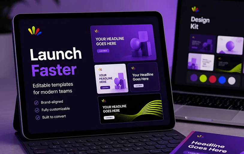
Building every page from a blank canvas is slow. Professionally designed templates give you a proven starting point and cut development time dramatically.
When Templates Are a Smart Choice
Templates make sense when you want a professional result fast, when you are building a common site type (agency, SaaS, portfolio, business), or when you would rather spend your time on content and customization than on structural layout. A good template has already solved spacing, hierarchy, and responsiveness for you.
Customize Templates Properly
A template is a starting point, not a finish line. Replace the demo copy with real, benefit-focused content. Swap in your own images. Adjust the palette and fonts to your brand. The goal is that no visitor can tell it started as a template.
Maintain Brand Consistency
When you customize, apply your brand tokens (colors, fonts, button styles) consistently across every imported page. This is where template-based sites often slip: the homepage looks branded, the inner pages still look like the demo.
For Bricks users, this is one place BricksFly stands out. Its 30+ full website templates ship with the inner pages included, so you import a complete, coherent site (homepage plus About, Services, Contact, and more) rather than a single landing page you then have to extend by hand. Paired with its 500+ premium sections, you can assemble and customize a professional Bricks site far faster than building from scratch.
NOTE: “Full website template” and “landing page template” are not the same thing. A full website template saves you the entire site structure, which is where most of the real time goes.
11. Optimize Website Speed Without Sacrificing Design
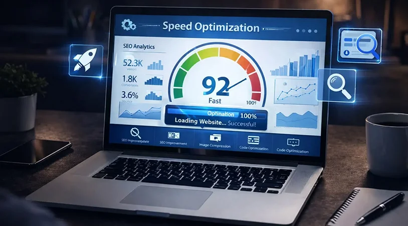
You do not have to choose between a beautiful site and a fast one. You do have to optimize deliberately.
Image Optimization
Images are the most common cause of slow pages. Serve modern formats like WebP, compress before uploading, and size images to their display dimensions instead of shrinking huge files in the browser.
Lazy Loading
Load images and embeds only as they scroll into view. WordPress does this natively for most images now, and it keeps the initial page load light.
Font Optimization
Limit the number of font weights you load, host fonts locally where possible, and use font-display: swap so text stays visible while fonts load.
JavaScript Optimization
Load only the scripts each page needs. Defer non-critical JavaScript. This is where lean builders and well-built animation tools pay off, because they add polish without piling on blocking scripts.
Caching
Use a caching plugin or server-level caching to serve pre-built pages instead of generating them on every visit. This is often the single biggest speed win available.
CDN
A content delivery network serves your assets from servers close to each visitor, cutting load times for a global audience.
Performance Testing Tools
Test regularly with tools like Google PageSpeed Insights, GTmetrix, and web.dev’s Core Web Vitals report. Fix what they flag, then retest. Measure, do not guess.
Common WordPress Website Design Mistakes That Hurt Conversions
Even good designers fall into these. Check your site against the list.
- Slow loading: The fastest way to lose a visitor before they see anything
- Poor navigation: Confusing menus and dead ends that strand people
- Weak CTAs: Vague or hidden buttons that fail to prompt action
- Too many animations: Motion overload that distracts and slows the page
- Inconsistent branding: Mismatched colors, fonts, and styles that read as sloppy
- Mobile issues: Layouts that break or frustrate on phones, where most traffic is
- Ignoring accessibility: Shutting out users and hurting clarity for everyone
Final Thoughts
A professional WordPress website that converts is not the result of one great decision. It is the sum of many deliberate ones: a fast foundation, a clear structure, a clean and mobile-first design, purposeful animation, honest trust signals, sharp copy, and steady optimization after launch.
Start with your goal, build on a fast foundation, and design WordPress website’s every page around the one action you want visitors to take. If you build on Elementor, Animation Addons gives you professional GSAP animation without code. If you build on Bricks, BricksFly gives you all in one toolkit, so you can build high-performance sites faster.
Design with intent, measure what happens, and keep improving. That is how a website earns its keep.
Building on Bricks and want to make animated, professional sites faster? Explore BricksFly for full website templates, 500+ sections, and no-code GSAP animation. On Elementor instead? See how Animation Addons brings GSAP-powered animation into the Elementor editor without code.
Related articles:
- Best Hosting Solution for Growing Membership Websites
- 6 Best WooCommerce Subscription Plugins for 2026
- How to Build a Subscription Website on WordPress?
FAQs
How much does it cost to build a professional WordPress website?
It varies widely. A DIY site can cost under $200 a year (hosting, a theme or builder, a domain). A freelancer-built site typically runs from a few hundred to a few thousand dollars. Agency projects start in the thousands and climb with complexity. The biggest variables are custom design, functionality, and content.
Which page builder is best for beginners?
Elementor is the most beginner-friendly thanks to its visual interface and large template ecosystem. Gutenberg, the built-in editor, is a strong free option for simpler, content-focused sites. Bricks Builder has a slightly steeper learning curve but rewards you with cleaner, faster output as you grow.
Can I build a professional website without coding?
Yes. Modern builders like Elementor and Bricks let you design professional sites visually. Even advanced GSAP animation is now no-code: tools like Animation Addons for Elementor and BricksFly for Bricks Builder let you create ScrollTrigger, SplitText, and interactive effects through a visual interface, without writing custom JavaScript.
Does animation improve conversions?
Subtle, purposeful animation can improve engagement by guiding attention and making a site feel polished and responsive. The key word is subtle. Too much motion distracts, slows the page, and hurts accessibility. Use animation to support the user’s journey, not to show off, and always respect reduced-motion preferences.
How long does it take to build a business website?
A simple DIY business site can take a few days to a couple of weeks. A custom professional build usually takes four to eight weeks, depending on the number of pages, custom features, and how ready your content is. Using full website templates, like those in BricksFly, can cut structural build time significantly.
Is Bricks Builder better than Elementor?
Neither is universally better; they suit different priorities. Bricks Builder produces cleaner, faster code and appeals to performance-focused and developer-minded users. Elementor has a larger ecosystem, more templates, and a gentler learning curve, which suits beginners. Both support advanced animation through dedicated tools (BricksFly for Bricks, Animation Addons for Elementor).
What makes a website look professional?
Restraint and consistency. A clean visual hierarchy, generous white space, a limited color palette, readable typography, consistent branding across pages, and fast load times. Professional sites remove clutter and make the important elements, especially the CTA, obvious.

Share this post


