

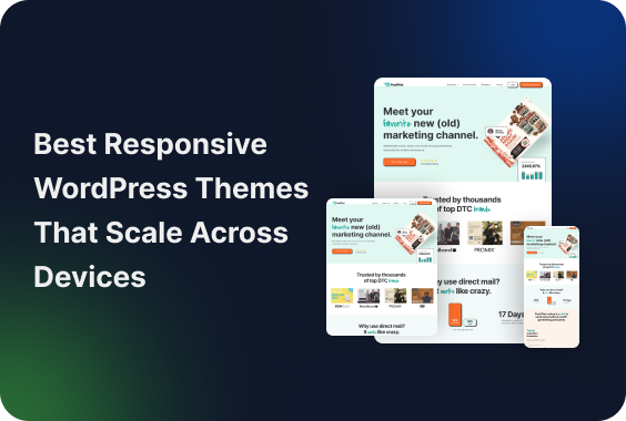
Responsive design isn’t a “nice to have” anymore, it’s the default expectation. Whether someone is reading a blog post, signing into a member area, or checking out a product, they expect the experience to work smoothly on whatever device they’re using.
What often gets missed is that responsiveness isn’t just about resizing elements. A well-built responsive WordPress theme keeps text readable, navigation intuitive, and important actions easy to find, especially on mobile, where a growing share of users now browse, sign up, and make purchases.
Below are eight responsive WordPress themes that consistently hold up across devices. They’re not focused on gimmicks or overly complex demos, just layouts that work once real content and real users enter the picture.
Crafto
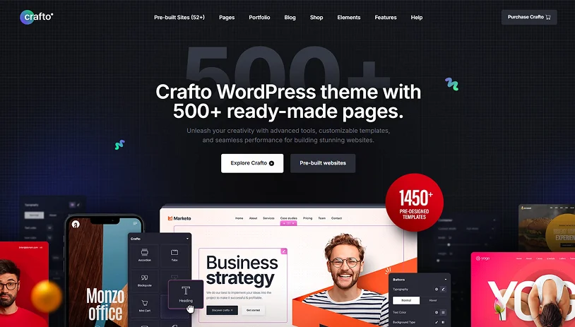
Crafto WordPress theme stands out for its practical approach to responsive design. Instead of relying on oversized demos or animation-heavy layouts, it focuses on structure, spacing, and typography elements that matter once real content is added.
It performs especially well with content-heavy layouts. Long-form pages, documentation, and member-only sections remain readable across devices without requiring custom fixes. Text stays comfortable on mobile, and spacing remains consistent as pages grow.
Crafto also handles forms and interactive sections reliably. Login pages, registration forms, and gated content maintain proper alignment on smaller screens, with buttons and inputs remaining easy to use.
Responsiveness feels built into the theme’s foundation rather than added later. Breakpoints behave predictably, and layout elements don’t shift unexpectedly when screen sizes change. Combined with smooth Elementor integration, this makes ongoing layout adjustments far less time-consuming.
Key Highlights:
- Stable layouts across devices.
- Mobile-friendly typography and spacing.
- Reliable handling of forms and member-only sections.
- Predictable breakpoints with minimal mobile fixes.
- Seamless Elementor integration.
Best fit for: Crafto remains consistent as your site grows, reducing the need for constant responsive tweaks and allowing you to focus on content and functionality.
Litho
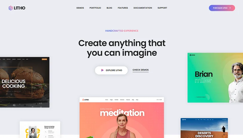
Litho follows a clean, professional design approach, and that philosophy carries through consistently in its responsive layouts. Pages are well-structured across devices, with spacing and typography that feel intentional rather than compressed on smaller screens.
This makes Litho particularly effective for information-driven websites. Service pages, feature explanations, and blog content are easy to scan on mobile, which helps reduce bounce rates and improve overall usability.
Because Litho avoids heavy animations and visual effects, performance stays reliable on mobile devices and improves user experience & search visibility.
Key Highlights:
- Clean, professional, responsive layouts.
- Well-structured sections for services and informational content.
- Typography remains readable on smaller screens.
- Easy customization without breaking responsiveness.
Best fit for: Agencies, startups, and business websites that prioritize clarity, performance, and structured content.
Pofo
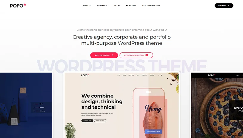
Pofo is built with visual impact in mind, and its responsive layouts do a solid job of preserving that impact across devices. Portfolio grids, images, and featured sections scale cleanly without feeling unbalanced or cluttered.
Pofo works best when visuals do most of the work. If your site relies heavily on long-form content or complex user interactions, you’ll want to plan layouts carefully to keep things comfortable on mobile.
Key Highlights:
- Strong portfolio grids that adapt smoothly across screen sizes.
- Image-focused layouts optimized for mobile viewing.
- Lightweight animations that don’t disrupt usability.
- Best suited for visually expressive websites.
Best fit for: Designers, freelancers, and visually driven portfolio websites.
Avada
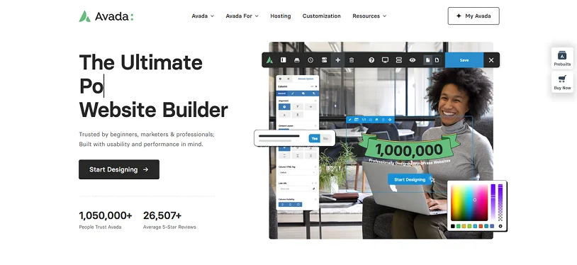
Avada is powerful; there’s no getting around that. It gives you a huge amount of control over how your site looks and behaves on different devices, which can be a big advantage if you know exactly what you want to build.
That flexibility, however, comes with a learning curve. On the responsive side, Avada does a solid job, but its advanced options accidentally overcomplicate things. If you’re not careful, it’s easy to end up with mobile layouts that feel heavier than they need to be.
When Avada works best is on larger or more complex websites where custom layouts are unavoidable. If you take the time to simplify sections and be intentional about mobile design, the results can be excellent. If you try to use every feature at once, performance and clarity can suffer – especially on smaller screens.
Key Highlights:
- Advanced responsive layout controls.
- Mobile-specific customization options.
- Large library of demos with adaptable layouts.
- Suitable for complex or large-scale websites.
Best fit for: Advanced projects or larger websites where deep customization is worth the extra setup time.
Hongo
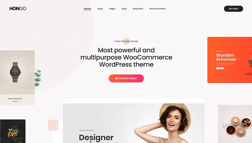
Hongo is built around modern eCommerce behavior, with a strong emphasis on mobile usability. Product grids, filters, and navigation menus are designed to feel intuitive on smaller screens.
Checkout flows are streamlined, helping users move from product selection to purchase without unnecessary distractions. This responsiveness is especially valuable for stores offering digital products or gated downloads, where ease of access directly impacts conversions.
Hongo’s mobile-first approach helps maintain focus on key actions, viewing products, adding items to the cart, and completing purchases.
Key Highlights:
- Mobile-optimized product listings and navigation.
- Responsive WooCommerce layouts.
- Touch-friendly shopping experience.
- Clean checkout flow across devices.
Best fit for: WooCommerce stores and product-focused websites that rely on mobile traffic.
Nexter Theme
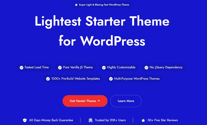
Nexter Theme is built with a strong focus on performance and flexibility, taking a lightweight approach to responsive design. Instead of relying on pre-designed layouts, it works as a starter theme that gives you a clean base to build on, which helps maintain consistency across different screen sizes.
One of the key aspects highlighted by Nexter is its minimal footprint. The theme is designed to load only necessary assets, which helps improve page speed and keeps the frontend experience smooth, especially on mobile devices.
Nexter Theme also avoids dependencies like jQuery, which can further reduce render-blocking resources and improve loading behavior across devices. This contributes to more stable layouts and faster interaction times, particularly on slower networks.
Customization is handled through global settings, including typography, colors, and layout controls, allowing you to maintain design consistency without repeatedly adjusting sections for different breakpoints.
It supports modern WordPress workflows, including compatibility with Gutenberg (Full Site Editing) as well as page builders like Elementor, making it adaptable to different ways of building websites.
Key Highlights:
- Lightweight theme focused on performance.
- Loads minimal assets for faster page speed.
- No jQuery dependency.
- Global customization options for consistent design.
- Compatible with Gutenberg (FSE) and Elementor.
Best fit for: Users who want a lightweight, flexible theme that prioritizes performance and gives full control over layout and responsiveness without relying on heavy pre-built designs.
Brando
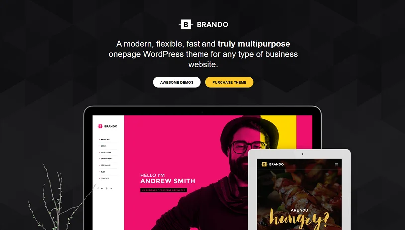
Brando keeps things simple, and that simplicity works in its favor when it comes to responsive design. Layouts are straightforward, sections are easy to follow, and everything scales cleanly across devices.
This makes Brando a reliable option for business websites where clarity matters more than visual complexity. Service pages, pricing layouts, and contact-focused designs all benefit from this approach.
Key Highlights:
- Clear & straightforward layouts that scale.
- Content-first design approach.
- Minimal distractions on mobile.
- Ideal for service-based websites.
Best fit for: Service providers, consultants, and small business websites.
Elementra
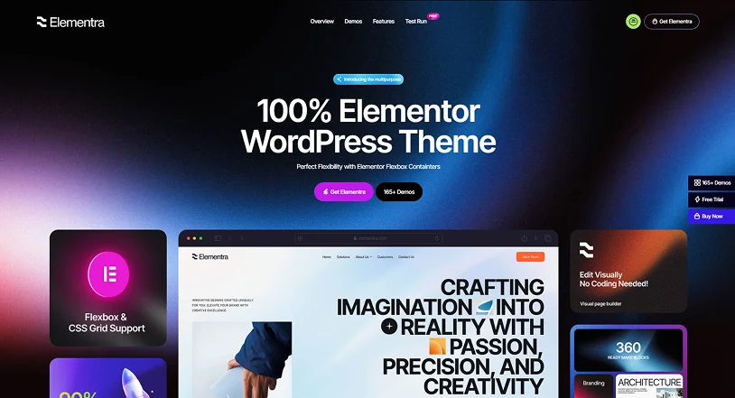
Elementra is built for users who prefer working visually with Elementor and want responsive layouts without a long setup process. Its templates are responsive out of the box, which helps reduce friction during builds.
It’s especially useful for landing pages and modular layouts where consistency across devices matters more than heavy customization.
Key Highlights:
- Pre-built responsive templates.
- Strong Elementor compatibility.
- Quick setup with minimal adjustments.
- Suitable for landing pages and modular layouts.
Best fit for: Elementor users who want ready-made, responsive layouts.
Pine
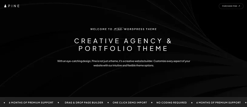
Pine takes a minimal approach to design, and that simplicity translates well to responsive layouts. Text, images, and white space stay balanced across screen sizes, making content easy to read and navigate – especially on mobile.
For creative agencies or studios seeking a clean presentation without visual clutter, Pine delivers a calm, focused experience that doesn’t distract from the work on display.
Key Highlights:
- Clean, minimalist layouts.
- Balanced typography across devices.
- Focused content presentation.
- Strong fit for creative portfolios.
Best fit for: Creative agencies and portfolio websites.
Final Thoughts
A responsive theme does more than make a site “look okay” on mobile. It directly affects how people interact with it. If text is hard to read, layouts feel cramped, users won’t stick around long enough to engage, sign up, or buy.
All of the themes listed here handle responsiveness competently, but they shine in different situations. Some are better suited for visual portfolios, others for online stores or content-heavy websites. Crafto stands out if you want something flexible that doesn’t require constant tweaking as your site grows.
The main takeaway is simple: don’t choose a theme based on demos alone. Think about how it will behave once real users start interacting, especially on mobile.
Related articles:

Share this post